

Magnus Industries
Description
Committed to the core. Magnus Industries develop innovative products that enhance properties of material components used in built-environment projects. Their products boost efficiency throughout all construction processes.
Client
Magnus Industries
Year
2020
Category
Branding, Packaging

Details
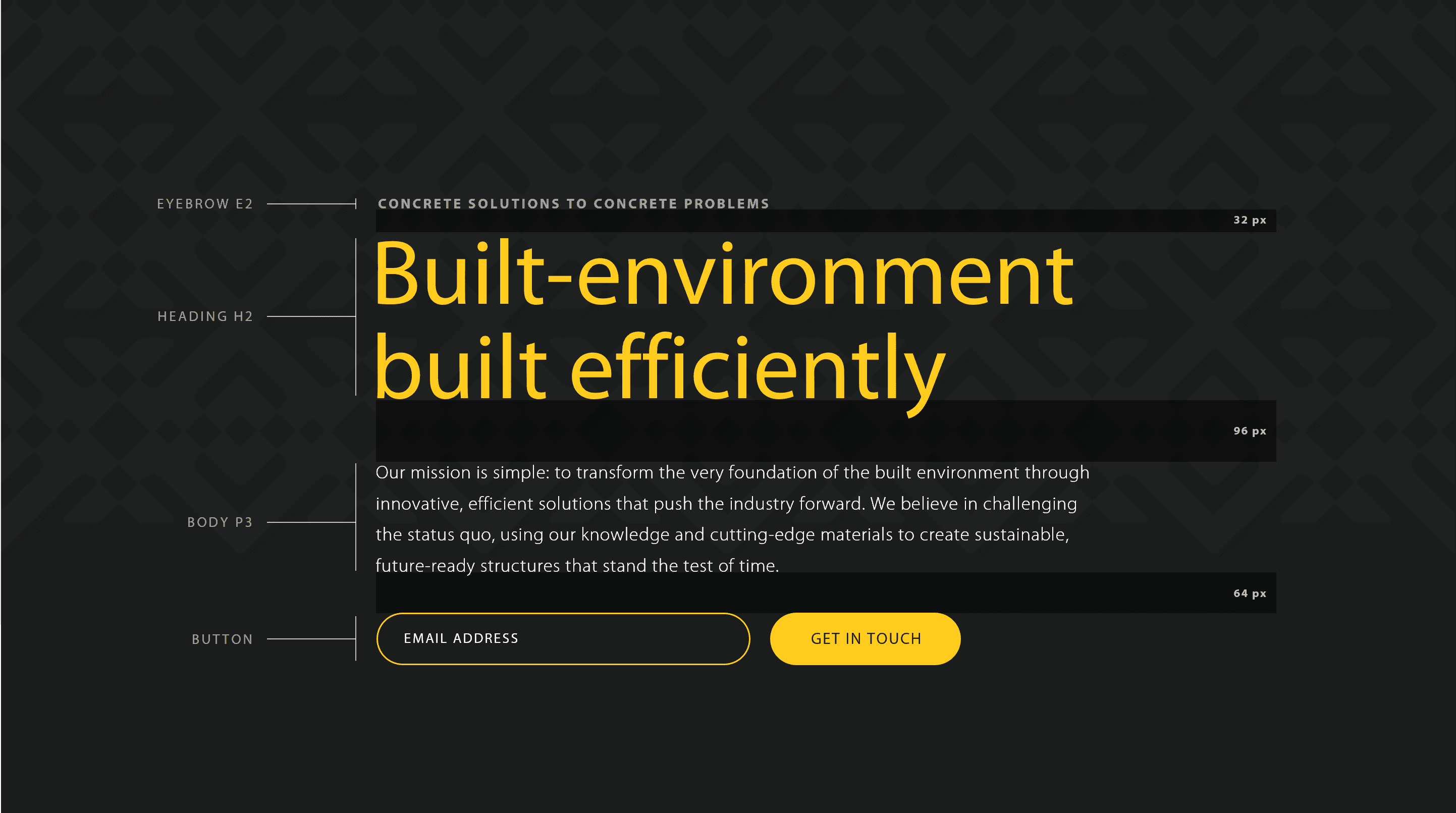
Magnus was established by a team of technocrats who sought to revolutionize concrete technology with their flagship product. With Magnus being well noted to be driven by Commitment, Thoughtfulness, and Innovation, I positioned their brand around the objective, “For the built environment to be built efficiently.”
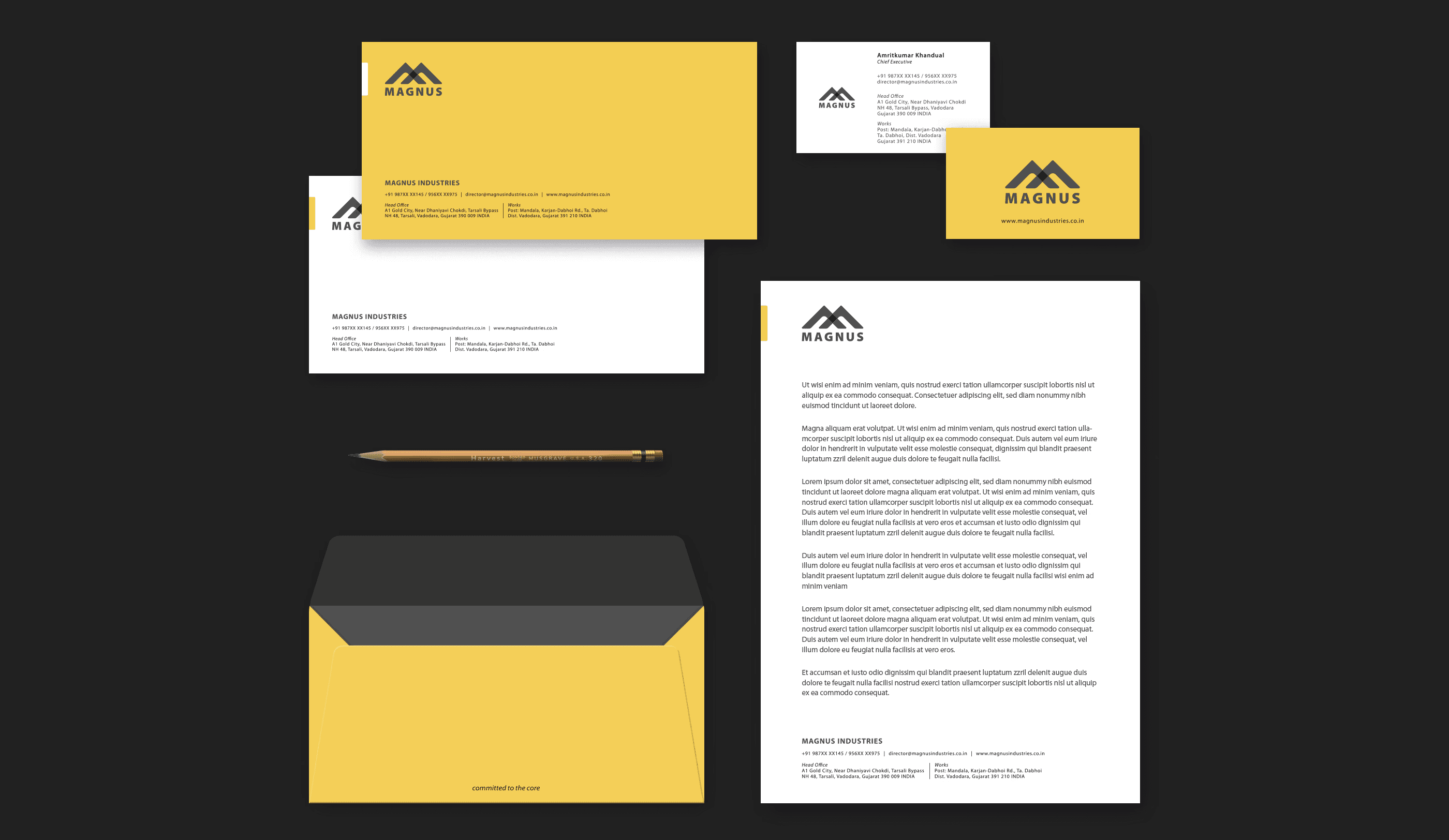
The logo for Magnus is a strong, solid lettermark with two upward, intersecting arrowheads, symbolizing coming together of tech and efficiency. It also symbolizes two great, magnus mountains with a diamond at their core.
Through these renditions, I was conveying Magnus’s dedication to bring about a great transformation in the fundamentals of construction materials. This inspired the tagline "Committed to the core.“ The lettermark went on to influence the design of product marks, patterns, infographics, and all other visual assets.
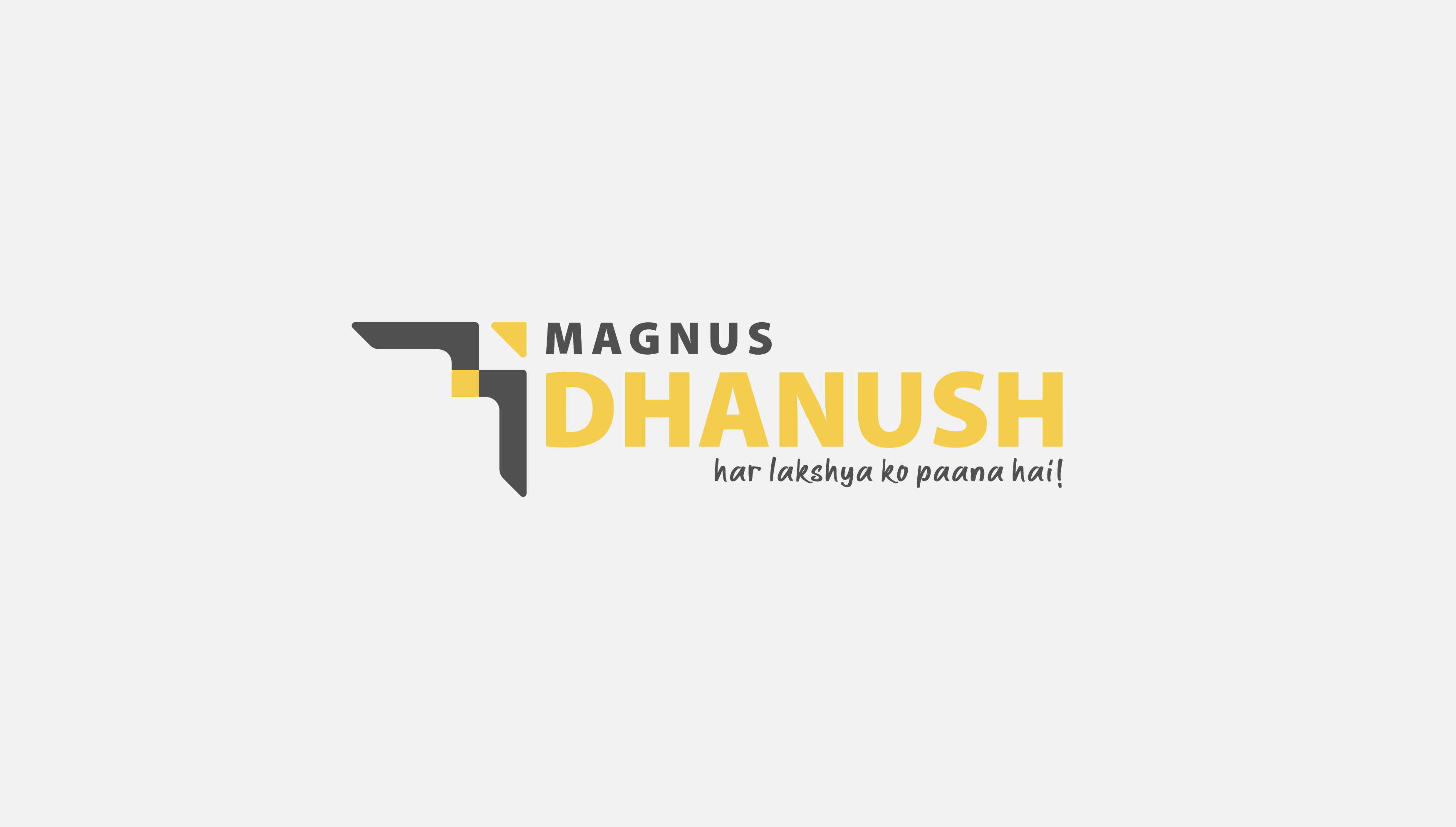
When it came to their flagship product, I helped identify and coin the name Dhanush—a bow; to symbolize aim, precision, drive and progress.
The logomark for Dhanush featured an arrowhead and the "M" from the lettermark for Magnus, reoriented and tweaked to represent the bow. While the mark captured the product’s objective, I helped connote the purpose through the tagline, “har lakshya ko paana hai!”
In crafting the visual language, I focused on creating and curating a grounded, trustworthy look that resonates with the Indian construction industry, to build faith across the industry as we foresaw a great shift towards using advanced material technology in construction.
The typeface ‘Myriad Pro’ extended the message through its versatility in all purposes of typographic hierarchy.