

imprint it Sans
Description
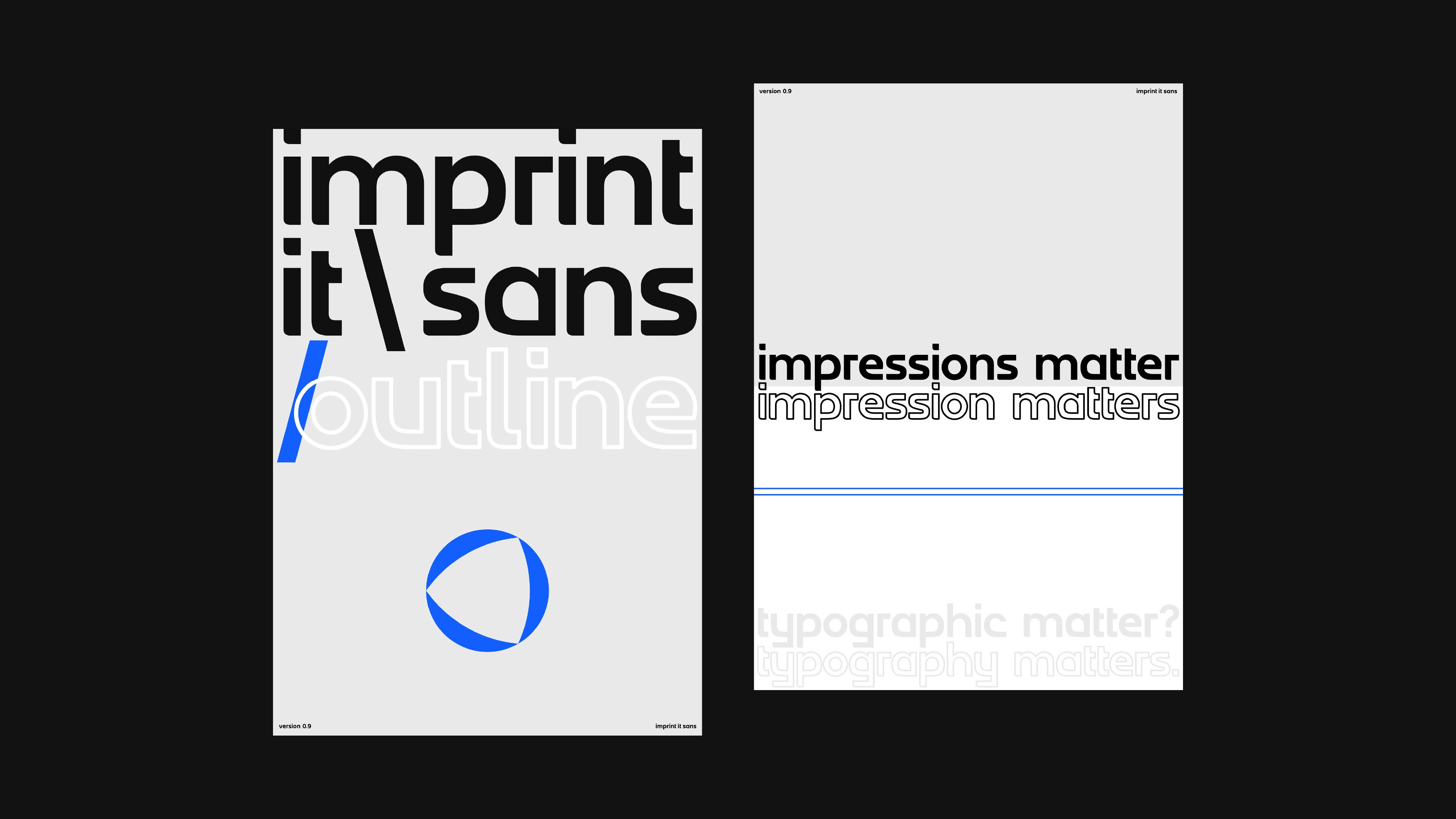
imprint it Sans is the new, improving and developing, geometric sans-serif display typeface of imprint it, by imprint it, and soon, for the world. The testament of its little successes so far come through my customary usage of imprint it Sans v0.9 and adaptation, imprint it Sans v0.9 outline, on Swiss-style typographic design posters.
Client
imprint it Studio
Year
2023
Category
Typeface, Poster

Details
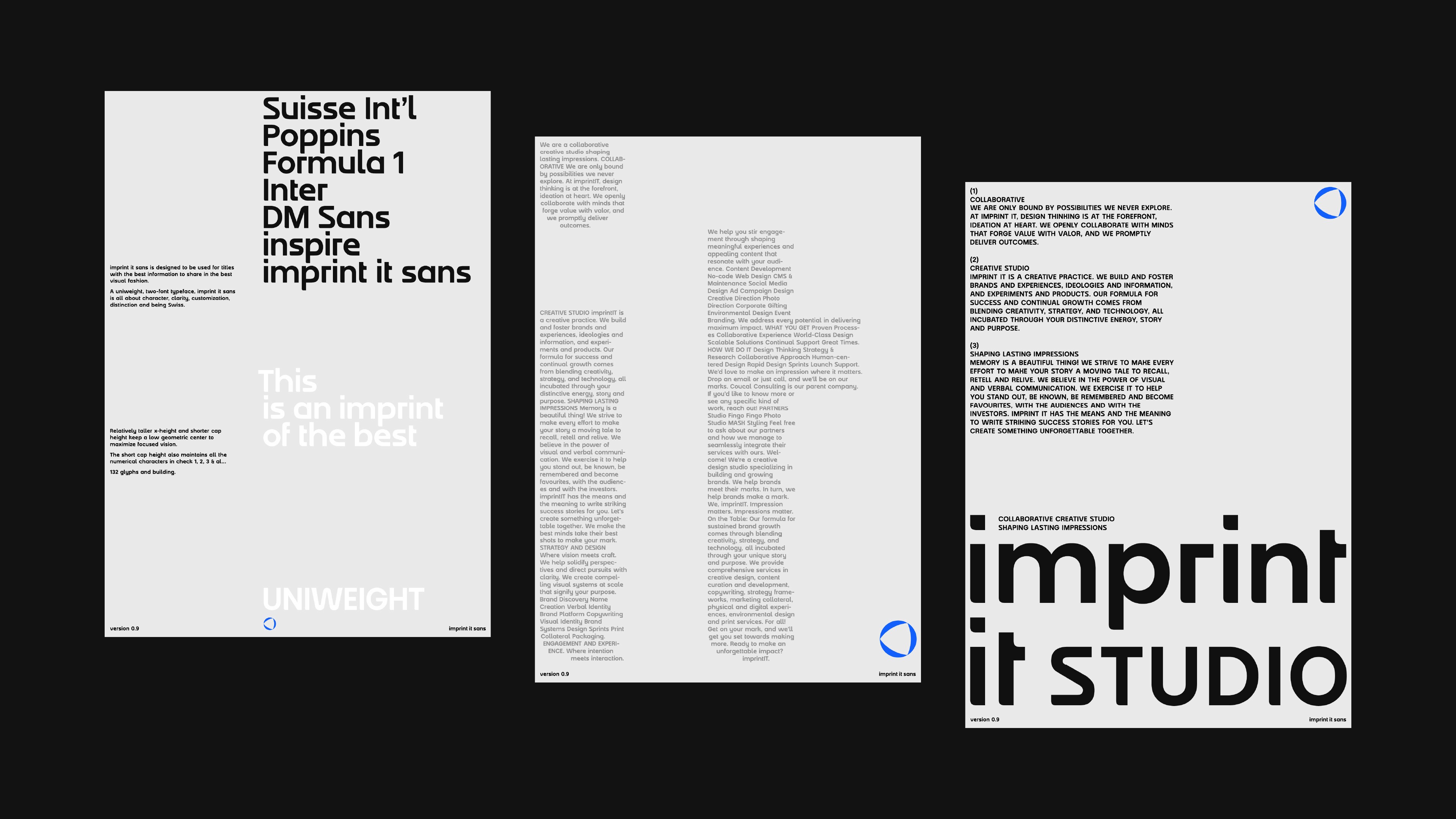
imprint it Sans is the new, improving and developing, geometric sans-serif display typeface of imprint it, by imprint it, and soon, for the world. For a single-style typeface, it doesn’t do horribly as body text; kind of like typing in bold, like there’s absolutely always a point to be made! Although, as of today, the ideal use case is for display, titles and headings.
Roadmap: With 132 glyphs in this version, v0.9, the global release version v1.0 will include 33 alternate glyphs with flat shoulders and varying terminals, 14 additional symbols, 56 planned ligatures, improved stroke lengths and widths, and over 500 custom kerning pairs—all with this one weight, 600.
Extended goal: With 160 ideated IPA symbols, 3 Devanagiri script cases studied for 128 Unicode code points, 2 variable axes in width and weight envisioned, imprint it Sans is my second biggest dream steadily unveiling!