

Hertz Electrical
Description
Only Hertz to be safe. Hertz Electrical Contractors are a confederation of industry professionals making modern products, technology and high-quality services accessible to moderate- and low-income societies of Zimbabwe.
Client
Hertz Electrical
Year
2021
Category
Branding

Details
Hertz was founded by two young entrepreneurs who saw potential in Zimbabwe’s energy sector. I helped identify the brand name “Hertz” to reflect the perfect alignment and shared vision of the founders, with the term serving as a metaphor for frequency and synergy.
Through our collaboration, we defined Hertz’s core attributes as Philanthropic, Expressive, and Canny, leading to the Single Most Important Thing (SMIT): Accessible infrastructure for the masses.
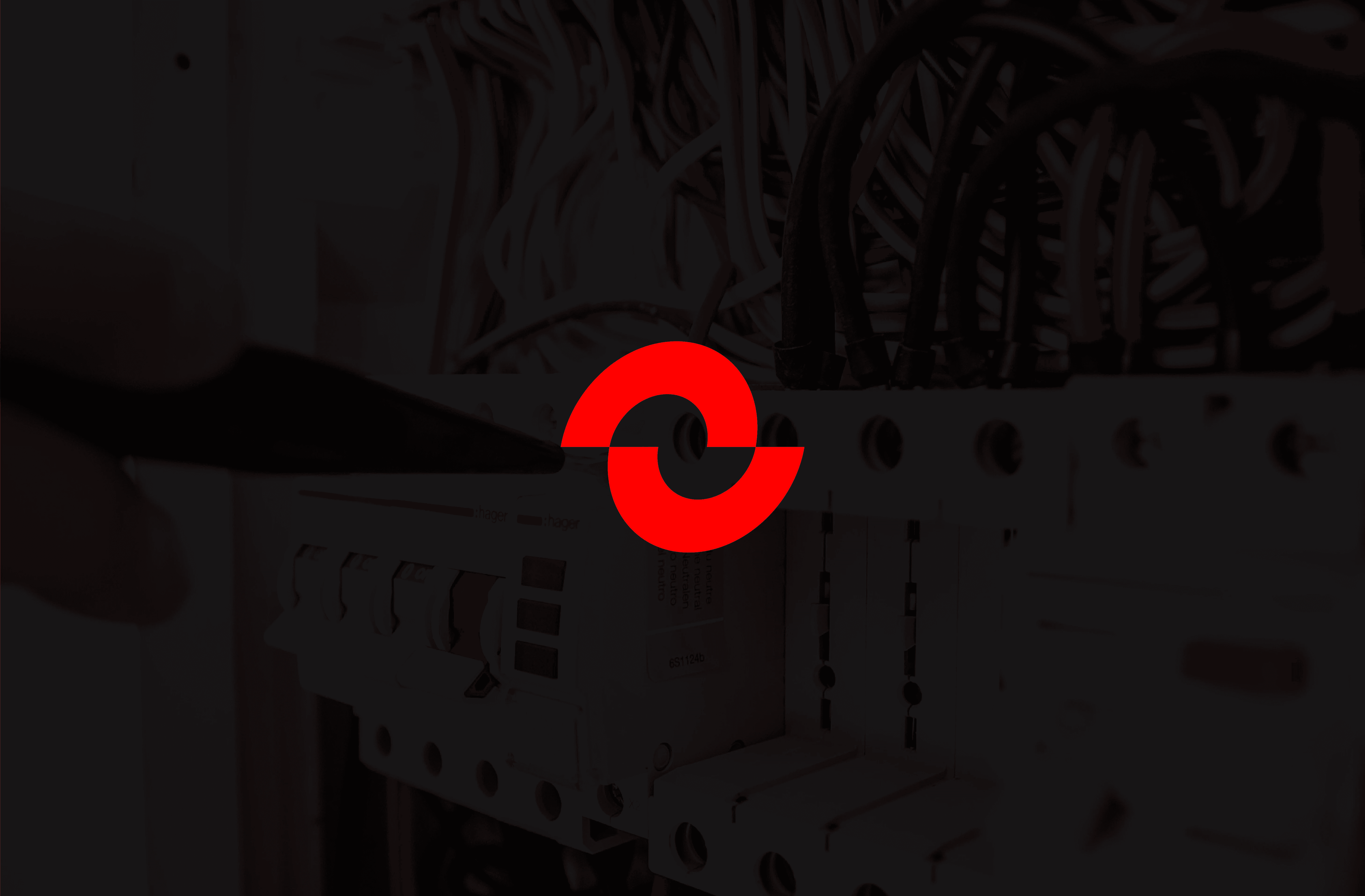
The logo design embodies both connectivity and equilibrium. I used two half-waves—symbolizing the two founders, provider and recipient, and technology and necessity. These forms, aligned but slightly offset, illustrate Hertz’s commitment to balanced progress through state-of-the-art technology.
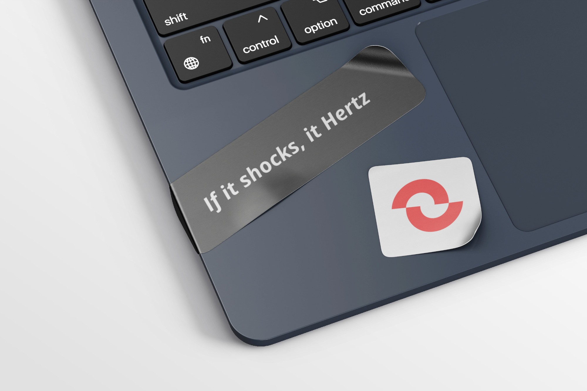
To reinforce the brand’s edge and approachability, and improve recognition, I introduced a brand tagline as a catchphrase with a clever twist: “If it shocks, it Hertz.”
A supporting slogan with a similar tone followed suite: “Only Hertz to be safe.”
Beyond the core brand, I developed sub-brands to unify the founders’ diverse ventures, creating a suite of names and logos under the Hertz identity. With retail, service, and future product lines branded as Wavez, Elementz, and Revz, I ensured each had a unique identity while maintaining cohesion with a bold color palette of red, black, and electric blue. The repeated "Z" across sub-brands further cement brand recall.